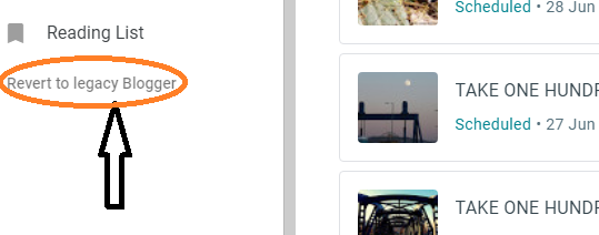
Are you sitting comfortably?
 |
| Look to bottom left of your dashboard to 'toggle.' |
One or two fellow bloggers have already touched upon this. I know MadSnapper is on the job! Let me first say...DO NOT PANIC!
Now let me say, there is a bit of adaptation required. This is Google hauling Blogger right up to date. They have actually been quite late in doing this... partly because at one stage about five years ago, there were hints of them disposing of Blogger altogether, in favour of the ***-awful G+ thing. That proved to be a white elephant for them, and the protest from Bloggers was quite heavy. So let us be grateful that we all didn't then have to go off and learn whole new systems like WordPress or Tumbler and so on. (They each have their good points, but none are perfect - and better the devil you know, right?)
And the devil is in the details here. WHAT IS IMPORTANT TO REMEMBER IS THAT OPERATION REMAINS THE SAME, IT IS MERELY THE LAYOUT THAT IS DIFFERENT.
I actually flicked to the updated version back in January and worked with it till April - when I flicked back to 'legacy' due to not being able to multi-select items for deletion. Notably, spam comments. Having to work through over a 100 one at a time was just not on the cards so returned to 'old school.'
Now that I have decided to return to the new, I find that in the month I've been away, they've tinkered further with it. Probably due to feedback... and you DO KNOW, donchya, that you can send them feedback??!!! Very important. If you are shy, or in doubt about your concerns, you can first of all check the help pages. (That '?' mark in the circle at top right.)
The other marks to the right of my orange arrow here, are HTML mode, Save, Preview and Publish. (NB: the preview no longer opens another tab but changes on this same page, and it is necessary to 'unclick' the eye to return to the editor.) Anyway, now it is possible to multi-select...if you hover over a post 'bar' you will see a small orange tick at the top left. I don't have any comments that I want to spam or delete just now, so I cannot confirm that this will allow bulk-deletion, but time will tell. I really don't get that much spam. Only Christmas and Easter...
The text editor is a wee bit closer to other platforms layouts now, and I don't mind it. Just have to adapt to the spatial differences for the mouse-action. I note that a 'table' tab has been added (or I don't recall it from legacy mode). This excites me a little because I do like rows and columns...😉
| isn't | it | fun | to | explore | anew??? |
Oh yes, the useful tools such as text alignment and language tools etc. are now hidden behind the three dots to the right of the text toolbar. (See that under the orange arrow in the image above?)
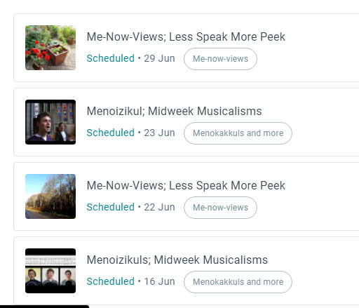
There are a few things I am unhappy with merely because of the way I work. Not being able to see all my posts in a simple list is annoying me at these early stages; I schedule so many of my posts, and it is a little challenging to track them in this boxy format.
In legacy mode, we just have the listing, and all the dates can be seen in one column - that way I know where I need to fill in posts (typically my Monday, Thursday and Friday posts). Here in the new, the dates are huddled under the titles and between status and labels and when doing a lot of work, it is a little easy to lose track... but I guess a few weeks of usage will get my 'eye' in. Concerning scheduling, my blogs are set on India time, but the new editor only posts by local time, so I need to remember to work a day ahead of myself... or just give in and shift to UK time. (You'll know if that happens because I'll arrive later in your readers...)
A lot of what the new setup is about is 'test it and see' - so don't be afraid of it! I know that a lot of folk have been having an issue with the placement and sizing of images. Permit me to take you through the process, as this IS something that has changed quite a bit in appearance (although the basics are still the same).
On selecting the image icon, you are presented with choices.
These are the same as offered previously. The difference in the 'upload', though, is you are presented with another screen, and here, now, you can opt to simply drag and drop. I have done that for all these screenshots and found it very straightforward. Otherwise, you can continue with the upload function and select from your files.
As to placement and sizing, click on the image once uploaded and it will phase to blue, with a little tab showing alignment icons, a 'pen' and an icon for adding a caption.
Clicking the 'pen' offers the resizing options.
If you are not familiar with 'alt text', that is useful to those who use text to speech facilities - i.e., those who have difficulty with sight. Clicking images with the alt text on them enables their system to narrate the image. Title text provides a hover description; if you hover over the first image I placed on this post, you will see that in use.
It is worth mentioning, too, that when in preview mode, you will see a bar at the bottom which enables different views. If yours is anything like mine, it will look as if tablet and phone views for this blog are a complete pig's ear. However, when I open the blog in my own tablet, it reads perfectly well. Could I make a request of you, dear readers, to advise me (if you read on your mobile units), whether this blog is tablet/phone-friendly???
So that's the basics and I say again, it is really only a matter of taste it and see, knowing that this will be the only thing on the menu before long. The option to return to the legacy mode will be available until then, but (unless there is a major protest) it will probably then disappear.
Have you tried out the new version? What are your thoughts?


YAM Aunty 87,000 thank yous for this. I hope you don't mind I copied and pasted into a word doc so I could print it.
ReplyDeleteI have been thinking about preparing a new post over on Madi's Poetry Blog. I set it up in case some day I might want to print out all the poems. LOL
Hugs Cecilia and I will advise should I try this.
Great tutorial! I was a bit concerned at first, but I really like that they made this version very simple to use on my phone and iPad!
ReplyDeleteYou are doing much better than I with the new blogger ~ I am having trouble getting my photos and don't want to have to reinvent every photo of me and my dog and copy and paste is difficult ~ I like being able to see a list of my draft posts and comments is another area I am not fond of ~ am not clear what post someone is commenting on ~ I should be telling blogger/google and not you ~ Thanks for 'listening' and giving your well explored input ~
ReplyDeleteBe Safe, Be Well,
A ShutterBug Explores,
aka (A Creative Harbor)
It is taking some time but I think I am getting the hang of the new set up. Just grateful they didn't scrap it!
ReplyDeleteThanks, Yam. I've stuck it and learned when I was stuck. I guess I need to send them a complaint about the darn redirect. It's slicing time off my life!
ReplyDeleteI was *not* happy the first day I used it. I was in a hurry, and I suddenly had to figure out a new interface. As I'm figuring it out, though, I don't have major complaints. I'll have to see how it works when I'm scheduling in advance.
ReplyDeleteI am just treading over the old track. Thank you for the information.
ReplyDeleteI hope it works for all... WP has something new too, but they are famous for messing things up, so I hope that news will not become an obligation
ReplyDeleteI switched to new version the moment it was available to me, and I have stuck to it, despite erratic functioning.
ReplyDeleteOnly consolation is they are making slight improvements every few days.
You are right, Blogger has been very slow in adding new features, though so many like us have stuck to it.
One useful feature Blogger had was the word count.
Hope you have given your feedback. I keep sending them anything I can think of.
Hari OM
DeleteYes, indeed Pradeep, feedback is what drives most software these days, and it gives Google a sense that it is joining in with the "open suite" culture. Not really of course, but overall, they have the formula that suits most folk, so we forgive them lots! You mention word count - as a writer, that's important, but I never discovered that - where did you find it? Am guessing that may not be there now? When I want to do wordcount articles, I use OneNote or Word first.
The improvements even in the month - but I am afraid that if they tinker too much now, they will end up with the same frustrations that caused G+ to be axed; it is impossible to be all things to all people, and a line eventually has to be drawn. However, if in the end, I can keep the look of blog that I want, that's all that matters! Yxx
Hi Yam - thanks for this ... I'll be back to read properly and then in a few weeks decide what to do - as I'm in the middle of things right now ... but will definitely read anything you post - and check out other links ... I trust my blogging friends: the good news. Take care and thanks so much for the thoughts here - all the best - Hilary
ReplyDeleteThanks for taking the time to put together this useful tutorial. I've been rubbing along with the new version without too much trauma so far but I'll book mark this for reference in case of future problems.
ReplyDeleteCheers! Gail.
It is such a pain. As if we need more change. Of course, the purpose is to help people only using smart phones to blog. I just cannot. My eyes are too bad.
ReplyDeleteThanks for the How-To. I think I've figured it out.
I've given feedback. xx
I hate change! Thank you so much for the tutorial. I'll be printing it out for sure!
ReplyDeleteI have played with the new version some. Certainly have not mastered it. In the old version I could 'slide' the photos around for placement. It took me a while to figure that ability in the old version. I feel sure I will figure it out in the new version. Thanks for your take on what you have found. namaste, janice xx
ReplyDelete